Happy April fools day, a couple of days ago. Seriously, the e-newsletter is no joke. In this issue we look at brand, marketing and design mistakes and the fools that made them.

Articles, advice and musings in the world of graphic design, branding, corporate reporting and so much more.
Happy April fools day, a couple of days ago. Seriously, the e-newsletter is no joke. In this issue we look at brand, marketing and design mistakes and the fools that made them.
'Googling' has become a verb. Talk about brand equity. There is much to be said about the 'dark art' of getting to the top of Google's search results, but most of it is garbage. Here we dispel the myths, advise on best practice and illustrate examples of a job well done. We're not going to include Pay Per Click (PPC) or any ads.
Logos: they're everywhere – you see them but don't always notice them. They help us recognise big brands like Nike and Shell, but what about those more workman-like marks that are stuck on the bottom of our kettles or sewn into our jumpers? Let's have a look at some of those ubiquitous logos and their hidden beauty.
Happy New Year, unless you are Chinese of course, in which case I'm a tad early. This newsletter is a tongue-in-cheek look at typical client requests made to designers and why a client might want to think again. :-)
F.R. David's song has a point about copywriting. Writing good copy, editing and getting your tone and content right isn't easy. And let's face it: I'd never proport to be an expert. I've written the odd tome and boy-oh-boy it's tough. But in doing so, there are a few things that I've picked up along the way which I'd like to share. Words certainly don't come easy to me.
Is it that time already?
Some people love it, some loathe it – a lot of people don't believe in it. But here it is. Christmas comes but once a year and of all the religious festivals this dominates the western world. This e-bite is an 'extra' – a Christmas bonus, if you like. Let's put on our design hats...ho, ho, ho... and enter the design world of clichés.
As part of a branding strategy and positioning, we are often asked to write or review the organisations 'mission statements. These bits of copy do a number of 'jobs' and should help the organisation communicate with the outside world as well as their own staff. Here then are a few pointers that should help you when thinking about putting together a set of texts.
If you're commissioning design, the process we take as designers may seem a mystery. Whether it's a new corporate identity, website or annual report, the process we go through with you sometimes needs explaining. I'll try to do it here... wish me luck.
Presenting to an audience is a daunting task. No matter how old you are, the nerves tingle, the senses are heightened and palms are sweaty. I'm not the best presenter in the world, but I have learnt a few things and marvel at the best. The best being Winston Churchill. His ability to combine phrases and timing make him one of the best public speakers the world has ever seen. How did he do that?
Navig8 opened its doors in 2000 in a tiny office on Goodge Street, so tiny that I could touch both walls at the same time, by just stretching out my arms. So we are really 15 and a bit years old, but adding 'a bit' to the graphic looks rubbish. We've moved offices three times. Every time, just around the corner, but in many ways we have come so far.
Infographics are a brilliant way to quickly communicate a journey, a process, a service, all sorts of things. They are far more visually engaging than a paragraph of text and done right, can deliver complex messages quickly and with style. We do a lot of them and there are certain things that help make them work hard for you.
Branding is an emotive subject, no matter if it is a rebrand, launch of a new brand or just communicating brand values. We all have an opinion. Brand, what does that mean? What on earth does a sub-brand mean? Can you brand under an existing brand and still have a brand? Oh my life, what is brand hierarchy? What is evolution and what is revolution in terms of brand?
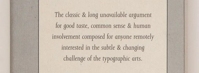
Graphic designers are always banging on about typography, but what are they going on about and does it really matter? In this installment we tackle the issues, discover the disasters and detail the do's and don'ts*.
The allure of creative freedom, public recognition and the joy of walking into a record shop anywhere in the country and seeing your own work, makes album cover design a graphic designers dream job. The days of the 12" double gate fold album offered a huge landscape for designers, now the reality is often a condensed digital download icon. The forerunner to Navig8, The Design Corps was established in the music industry back in the 90s. Let's look at the world's most iconic album covers and the designers behind them.
Colour plays a huge part in every aspect of design and can arouse strong opinions from clients and designers alike. Colours are often chosen on personal taste or some spurious theory. A client of ours once rejected a suggested colour pallet because it reminded him of the new curtains his wife had just bought, and he hated them. Let's look at good use of colour and how to get it right.
Sometimes you get a dream client. Something you'd just love to work on. In my case, this is the historic and global brand Barbadillo. I'm a Manzanilla drinker myself. It's a very dry sherry, made in a tiny area of Spain. Having visited the winery (Bodega) in the interests of research – I changed my view of what a drink's brand is and what it takes to make something unique. Let's look at the best.
After all these years (released in 1990) PowerPoint still plays a huge role in client presentations as the ‘go-to’ software for the account exec, sales bod and public speaker. We deliver a massive amount of templates and presentations for our clients with the same issues of budgetary restrictions and customisability being the main issues. Let's look at best practice, where the potential problems lie and what we can do together to produce a show-stopping presentation.
To be 100% clear from the outset, this is the Top 10 Graphic Design book for graduates and graphic designers starting out in the industry - but with an additional three books (shameless plug) written by our Director. We've all gotta eat, right? I've avoided design books that just show pages and pages of other people's work as much as possible. It turns out that a lot of these recommendations doff their caps to the past. That's not to say modern designers haven't produced great work and great books.
We all love infographics don't we? They are a brilliant way of communicating complex data, journeys, services etc. But like most things in design, they are not easy to get right. Things like too much content, not enough levels of data and the use of poor iconography will mean your infographic will not work hard for you, or at least not as hard as it should.
In this article I set out some of the things a client and designer should consider when creating an infographic.
Free pitching is a hot issue. Why do clients ask agencies to work for free? On many occasions, an agency will be asked to 'do the job whole' to be considered for the work. Madness.
The creative industry is the only industry, as far as I know, that gets asked to deliver work that has value, before being paid. Is this fair? Or as clients say, 'well that is just how it is'.