

Exploring typography
Graphic designers are always banging on about typography, but what are they going on about and does it really matter? In this instalment, we tackle the issues, discover the disasters and detail the dos and don'ts.

Do
• Close up letter spacing and kern everything over 16pt, even Word lets you close up spacing
• Use a light weight font for really big headlines
• Set your leading 2pt bigger than your text, eg: 9.5pt on 11.5pt leading
• Use 'curly' quote marks and apostrophies instead of inch marks
• Don't put double spaces after a full stop, double spaces are sinful
• Use italics to style a publication's title, like this, The Art of Typography, by Jane Smith

Don't
• Use too many sizes, most documents and websites can get away with just using three or four type sizes
• Use 'titling' font for body text, Copper Plate for instance
• Colour type in too many different colours, a one or two coulor palette will work best
• Put too much space after a subhead, best to put space before, so that the subhead sits with the content it belongs with
• Use too much bold or heavy weights, they don't make text stand out more.

Typographic curiosities and QIs
• Verdana was designed for Microsoft and specifically for use on screens.
• Open Sans is a free sans serif font designed for Google and optimised for screen now overtaking Verdana as the web designers favourite.
• The London Underground font designed by Edward Johnston strongly resembles Gill Sans. The reason might be that Eric Gill was one of Johnston's students.
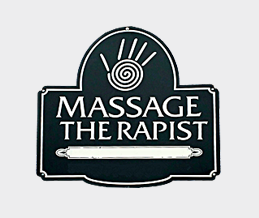
Kerning, Catnip for designers
Designers love kerning, they'd kern all day long if you let them. Kerning is adjusting the space between individual letters. This is reserved for headlines or type at a large size. Not for body text, imagine how long that would take! Kerning aids legibility, making the words easier to read. As a general rule the designer will remove space when kerning. Is it important? Well the sign writer who did this sign didn't think so.

What type are you?
Here's a list of 'famous' font personalitites.
• Obama used Gotham in his campaign, perhaps he wanted to be like Batman.
• UK road signs use the aptly named Transport font designed in 1963.
• The most derided font (by designers) is Comic Sans. Reserve its use for comics.

Widows and orphans
There are certain things to look out for when looking for good typography, here's a few that separate the men from the boys.
• Correct use of a hyphen and en dash. You can learn the right usage here.
• An elipsis (...) should have no space before it, be only three dots and one space after it.
• A widow is a word or line of text that is forced to go on alone and start its own column or page. An orphan is a single word at the bottom of a paragraph.
*This email package makes a typographic blunder by default. The headline What's has an inch mark, not a real apostrophe, like this: ’ instead of this: '.
Real apostrophies are 'curly'. Unfortunately email editors don't let you control your type!