
Reverse engineering your brand colours
Getting a visual colour match across different channels and mediums enhances brand consistency and recognition. This is an issue that branding and rebranding agencies seem to overlook. Here’s how you do it.
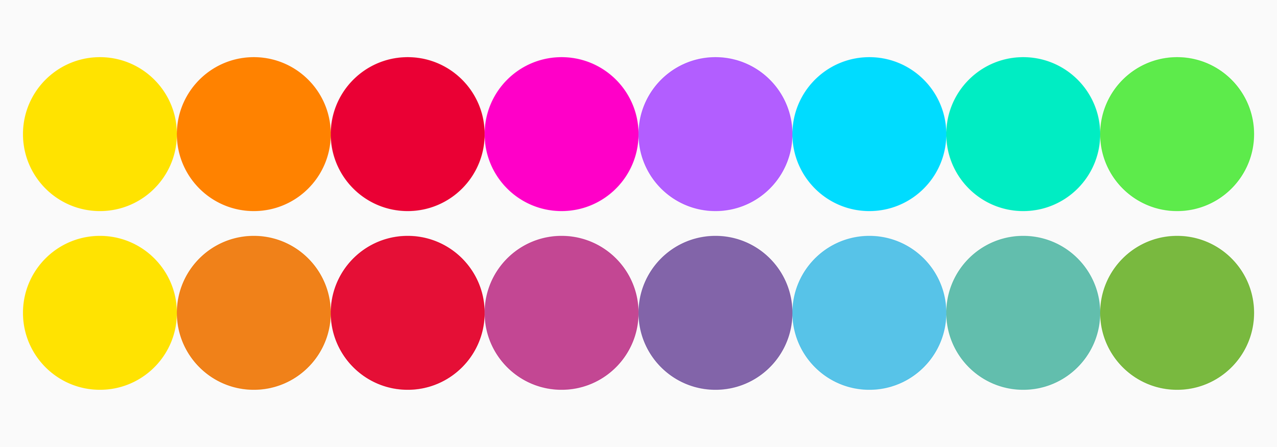
Before we get started, let’s establish what the ‘problem’ is. Most people know (and all designers should know) that a colour will render differently depending on the medium or channel it is intended for. For example, an RGB colour will render brightly on screen but will print in a duller, ‘flatter’ colour.
This is because the two colour ‘spaces’ or gamut, are different. A gamut is a range with which the output can achieve. With CMYK, the gamut is smaller than RGB. The eye can see millions of colours. Printers and screens have a limited gamut, with screens delivering a higher number.
When delivering a branding or rebranding project, the designers will often deliver two, or even three definitions of the palette, for instance, CMYK, RGB and Hex.
However, as stated above, these may render wildly different to the eye. Some colours (brighter and more saturated colours) suffer more than others. You can get a navy blue to look right on almost anything.
As you can see from the masthead image of this blog (this is a real-world example) these colour palettes have been created in a very professional way, but they do not visually align.
A lot of organisations pay little attention to this and live with the end result. But they don’t have to.
The trick is to reverse-engineer the colour palette for the brand scheme. This takes a little bit of work (sometimes a lot) and quite a bit of testing. Without giving away some hard-earned trade secrets, here is how you do it.
Before you start, you need to understand that what we are aiming for is a good compromise, or what a printer would call in the old days a ‘commercial match’. What we are aiming for is the best possible match without compromising too much on the identity’s look.
We have established that the CMYK has a smaller range of colours. So start by selecting your colours in CMYK. Get a high-quality print test sheet run, on both gloss/silk and matt/uncoated stock first. Whilst you are at it, produce a printed test sheet with all the percentage tints on it as well, it will give you a really good overview.
Adjust and re-test as necessary. Establishing the colour palette is a very important stage in your branding process.
Now visually match your screen colours to the printed sheets. This is not easy. The light conditions and the monitor types will vary enormously. That is why it will be a compromise.
You can start by simply converting your CMYK palette into RGB and letting the computer do the leg work. But the results are usually only a starting point.
Try and get into as natural light as possible, when looking at the test sheets. Select the RGB colours accordingly. Then test on as many monitors as possible, PC and Mac, phone and tablet.
You will need to make tiny adjustments as you go. For instance, the conversion from CMYK to RGB may deliver a drab result and you may need to go back to the CMYK palette and brighten them a notch. This will be particularly evident when looking at the printed test sheets on uncoated stock, where the colour will flatten considerably.
Given that most publications are delivered digitally these days, the RGB palette may be the most important, depending on the organisation’s needs.
If done right, you can bring the visual match closer together.
This kind of attention to detail when delivering a branding scheme makes all the difference and creates a much more consistent, robust identity.