In part one, we covered the basics of type, including headlines, standfirsts, subheads, body copy, paragraphs and bullets. In part two, we will look at alignment, font weights, colour, kerning and word spacing.

Articles, advice and musings in the world of graphic design, branding, corporate reporting and so much more.
Viewing entries tagged
readability
In part one, we covered the basics of type, including headlines, standfirsts, subheads, body copy, paragraphs and bullets. In part two, we will look at alignment, font weights, colour, kerning and word spacing.
I’m not going into selecting type or any of the other aspects of typography; this blog focuses on the setting of type. These principles can be applied to documents (both print and digital), websites, social media assets – anything you produce using type.
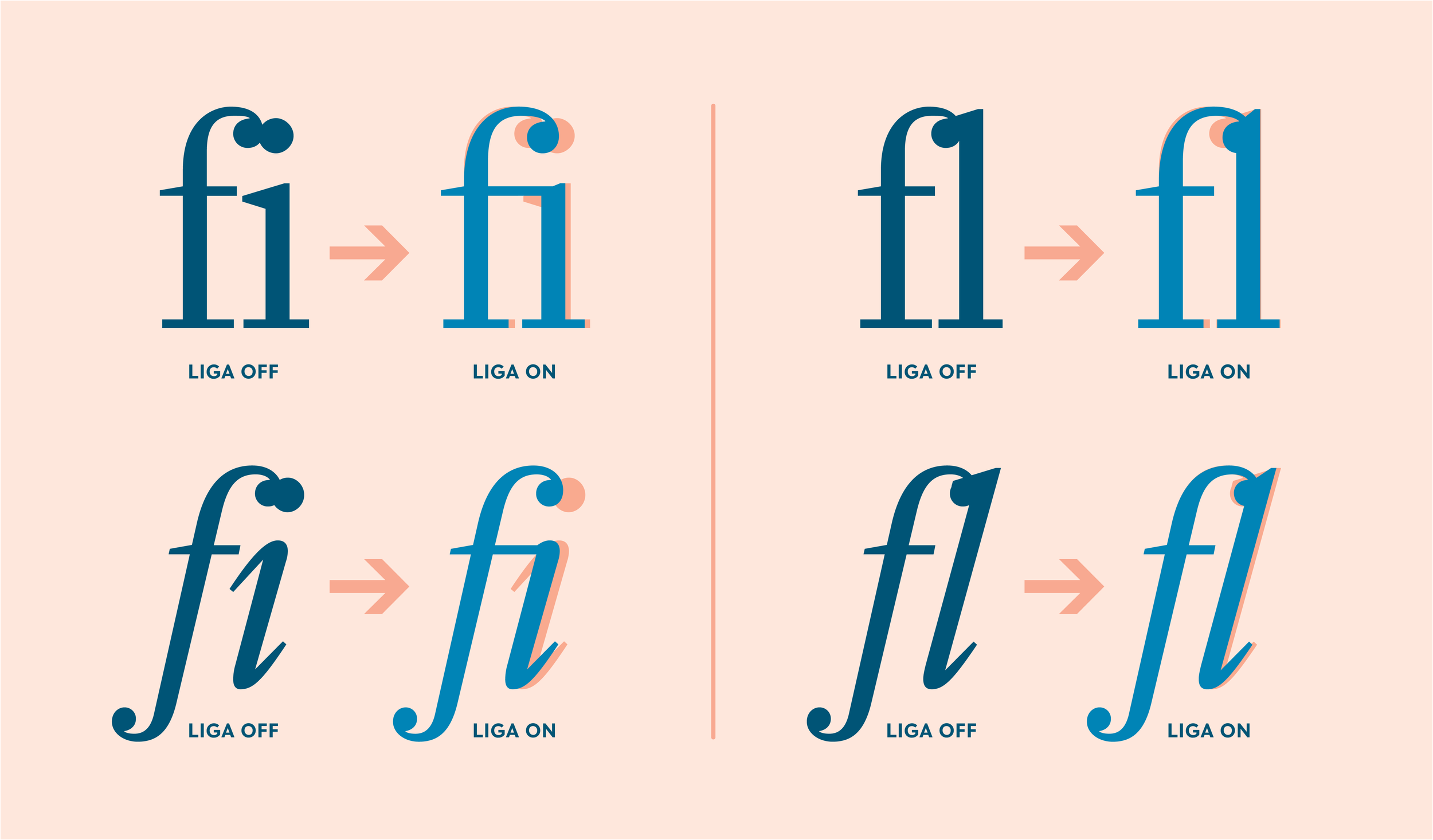
Ligatures are ‘special characters’; not all fonts have them and they are always easily accessible.
It applies to anything that you hope will be read and understood. Designing to ensure communications are accessible should always be on a designer's mind, not just when producing materials for an older audience or the visually-impaired.
F.R. David's song has a point about copywriting. Writing good copy, editing and getting your tone and content right isn't easy. And let's face it: I'd never proport to be an expert. I've written the odd tome and boy-oh-boy it's tough. But in doing so, there are a few things that I've picked up along the way which I'd like to share. Words certainly don't come easy to me.
How to overcome the seven deadly sins of typography including reading the negative space in letters as much as the outline itself.